A blog post that’s a little too complex still gets read. A button that’s a little too complex loses the click. There’s no scrolling back to reread a confusing “Continue” button. A user either gets it in under a second, or they hesitate. Hesitation is where conversions die.
This checklist covers the three spots where product copy carries the most weight: buttons, error messages, and onboarding. It also covers something most checklists skip: the actual WCAG rules behind a good error message, not just a style opinion.
Key Takeaways
- WCAG 3.3.1 (Level A) requires an error to appear as text. Color or an icon alone doesn’t meet the rule.
- WCAG 3.3.3 (Level AA) goes further: when a fix is knowable, the message has to suggest it.
- Button labels work best as a specific verb plus the outcome, in sentence case, at two to four words.
- Onboarding and empty-state copy need a lower reading level than copy aimed at returning users.
Why microcopy has less room for error
A user reading a blog post has some patience. A user staring at a blank form field, mid-task, has almost none. They’re trying to finish something, not read an article. Any word that slows them down is a word too many.
Short sentences make a blog post easier to skim. A button label pushes that same idea to its limit. The whole message has to survive in two or three words, the same way shorter sentences make a paragraph easier to read, just compressed into far less space.
Button label best practices: verbs, word count, and case
Design systems don’t all set the same word limit, but they agree on the direction: shorter is better. Google’s Material Design guidelines call for short labels in sentence case. IBM’s Carbon Design System says the same. Adobe’s Commerce admin guidelines cap most buttons at three words, four if a short verb needs the extra word. GOV.UK’s Design System skips a hard number entirely. It just asks for sentence case and a clearly named action.
Trimming a button label takes the same discipline as hitting an exact essay word count, just in reverse. Instead of stretching to a minimum, you’re cutting to the fewest words that still make sense.
A few rules consistently separate a clear button from a confusing one:
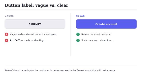
- Use a verb, and name the outcome. “Submit” tells a user nothing about what happens next. “Create account” or “Send message” does.
- Skip vague link text like “click here,” “more,” or “next.” This isn’t only a style problem. It’s an accessibility problem. Screen reader users often pull up a list of every link on a page, read out of order and with no surrounding sentence. WebAIM, the web accessibility research group, is direct about this: link text has to make sense on its own. Five links that all say “click here” become useless in that list, even though each one reads fine in its original sentence. (“Next” is a fair exception at the bottom of a multi-step form, where the meaning is already clear.)
- Default to sentence case. Write “Create account,” not “Create Account” or “CREATE ACCOUNT.” Material Design, Carbon, and GOV.UK all land on this independently. Sentence case reads faster than title case or all caps, and it feels less like shouting.
How to write error messages: what WCAG actually requires
Error messages get read at the worst possible moment. The user is already frustrated. A vague message just adds to it. This is also one of the few places in UX writing with a real, testable accessibility rule behind it, not just a style opinion.
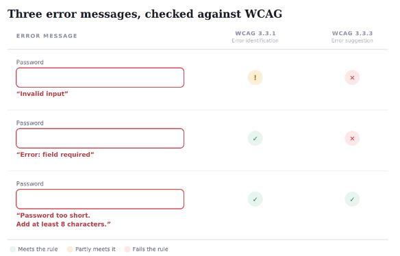
WCAG’s success criterion 3.3.1, Error Identification, is a Level A requirement. It says an error has to be spelled out in words when it’s detected, not just implied by color, an icon, or a red border. A field that simply turns red fails this rule outright, even if the problem looks obvious to a sighted user. Success criterion 3.3.3, Error Suggestion, is Level AA and goes a step further. When a fix is knowable, the message has to suggest it, not just flag that something’s wrong.
A good error message does three things, usually in one or two short sentences:
- States what went wrong, specifically, not generically. (“Invalid input” tells the user nothing.)
- Explains why, if the reason isn’t obvious.
- Suggests the fix, when one exists.
Write these in active voice, aimed straight at the user. “You left the password field blank” reads faster than “The password field was left blank.” That gap between active and passive phrasing isn’t just a preference. It’s the same gap a passive voice readability check is built to catch.
“Password too short. Add at least 8 characters.” does all three jobs in six words. “Invalid input” does none of them, and it’s still one of the most common error messages on the web.
Onboarding microcopy: writing for a first-time user
Onboarding copy and empty states share one problem: they’re often the very first product copy a new user reads, before they have any context for your product’s terms or how it’s supposed to work. Jargon a returning user would skip right past can stop a new user cold. That’s exactly why plain language matters more here than almost anywhere else in the product.
A few principles matter most at this stage:
- Explain the “why” before the “how.” A new user doesn’t yet know why a step matters. Copy that jumps straight to instructions can feel arbitrary. One sentence of context before the instruction usually fixes this.
- Keep empty states actionable, not just descriptive. “No projects yet” states a fact. “Create your first project to get started” gives the user something to do. That’s the difference between a dead end and a next step.
- Write for a first-time reader, not a power user. This is the same reason cold emails and landing pages read best at a lower grade level. A returning user’s familiarity forgives complexity that a first-time user’s doesn’t.
- Break multi-step onboarding into one action per screen. A screen that asks a new user to do three things at once splits their attention right when they have the least context to know what matters most.
Good onboarding copy tends to disappear once a user has seen it a few times. That’s the point. It’s scaffolding for the first few minutes, not permanent interface text.
A 10-point UX writing readability checklist
Run any new microcopy, buttons, errors, onboarding, or anything else, against this before it ships:
- Does every button label use a specific verb, not a vague one like “Submit” or “OK”?
- Is every button label as short as it can be while still naming the outcome?
- Does all link text skip “click here,” “more,” and “next” (outside a form pager)?
- Does every error message describe the problem in words, not just color or an icon?
- Does every error message suggest a fix, when one is knowable?
- Would a first-time user understand this copy with no prior context?
- Is there one clear next action, not several competing ones?
- Has jargon been swapped for a plainer word wherever one works?
- Is the tone consistent with the rest of the product’s voice?
- Has this copy been tested on someone who didn’t write it?
Check your microcopy’s readability
Paste any block of product copy into ChronoLedger’s checker to see its Flesch reading ease score. It’s built for full paragraphs, but the same score works on short text too. That makes it a fast way to run this checklist against real copy instead of just the examples here, which is especially useful for onboarding flows and help text, where sentence-level readability still matters even at a small scale.
FAQ
What’s the ideal button label length in UX writing?
There’s no single official number, but the direction is consistent across major design systems: shorter is better. Adobe’s Commerce admin guidelines cap most buttons at three words, four if a short verb is needed. GOV.UK’s design system skips a word count entirely and just asks for sentence case plus a clear action. As a working target, aim for two to four words that name the actual outcome, not the mechanism behind it.
What does WCAG actually require for error messages?
WCAG’s success criterion 3.3.1, Error Identification (Level A), requires errors to be spelled out in text. Color or an icon alone isn’t enough. Success criterion 3.3.3, Error Suggestion (Level AA), requires a suggested fix whenever one is knowable. Together, they rule out a red border with no text, or a generic message like “Invalid input.”
Why is “click here” considered bad UX writing?
Beyond sounding vague, it creates a real accessibility problem. WebAIM points out that screen reader users often browse a page’s links as an out-of-context list, where several “click here” links become indistinguishable from each other.
Should onboarding copy be simpler than the rest of the product’s copy?
Generally, yes. A first-time user has no context yet for your product’s terms, so onboarding and empty-state copy usually need a lower reading level than copy aimed at returning users.
Where to go from here
Microcopy carries more weight per word than almost any other kind of writing on a product. There’s no rereading a paragraph to catch what a confusing button meant. That’s why this checklist earns its place before anything ships, not after a user gets stuck on a button, an error, or an onboarding screen.
Keep button labels short and specific. Write error messages that actually meet WCAG’s error-identification and error-suggestion rules. Write onboarding copy for someone who has never seen your product before.
Want to check your own copy? Paste it into ChronoLedger’s checker and see how it reads.
Pingback: Dale-Chall Readability Formula: How It Differs From Flesch-Kincaid